

Dry Dock Brewing Company Unveils New Branding & Packaging Designs
At the core of any beer we love, is the story.
It’s as important as the ingredients in the beer itself. We fall in love with breweries because of the people that work there, memories at the taproom, and the products they make. All of this is communicated using the brewery’s brand.
Today, Dry Dock Brewing Company unveiled a refreshed look with new bold font, eye-catching colors, and recognizable design elements from their nautical roots with a new modern touch. Each canned beer displays new signature art, which is reflected through its branding as well. The updated designs will also extend to the brewery’s merchandise with subtle updates in both taprooms.
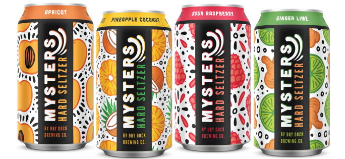
The brewery worked with Blindtiger Design in Seattle, WA in the development of its new look, as well as for its hard seltzer line called Mysters Hard Seltzer. Since its inception, Dry Dock has featured an iconic nautical theme that influences the beer names as well as all of the branding elements. This is the second design change to the brewery’s logo, but the first major redesign for the brewery.
“Our old branding is iconic, but we felt it was time to update and give our brewery a sleeker and more modern look. After a year of working closely on this project, we couldn’t be happier with the end result.” said co-owner Michelle Reding.
Dry Dock joins Avery Brewing, Oskar Blues, Prost, Left Hand, Lone Tree, and several other established breweries that have redesigned, refreshed, and rebranded over the past few years. Dry Dock was the first brewery in Aurora, Colorado, and is now one of Colorado’s top producing breweries with 25 medals from the Great American Beer Festival and 8 World Beer Cup awards. This brand refresh adds another moment in history for the beloved brewery.
Here are some key takeaways from the new design:
LOGO
Dry Dock has removed the iconic orange ribbon and golden sunset behind a full-color wooden ship sailing across the current for a single color blue wooden ship, identical to the original design, with an eggshell background. The words “Dry Dock Brewing • Aurora • Colorado” now wrap around the top and bottom of the logo, creating a focus on the ship in the middle of the design.
![]()
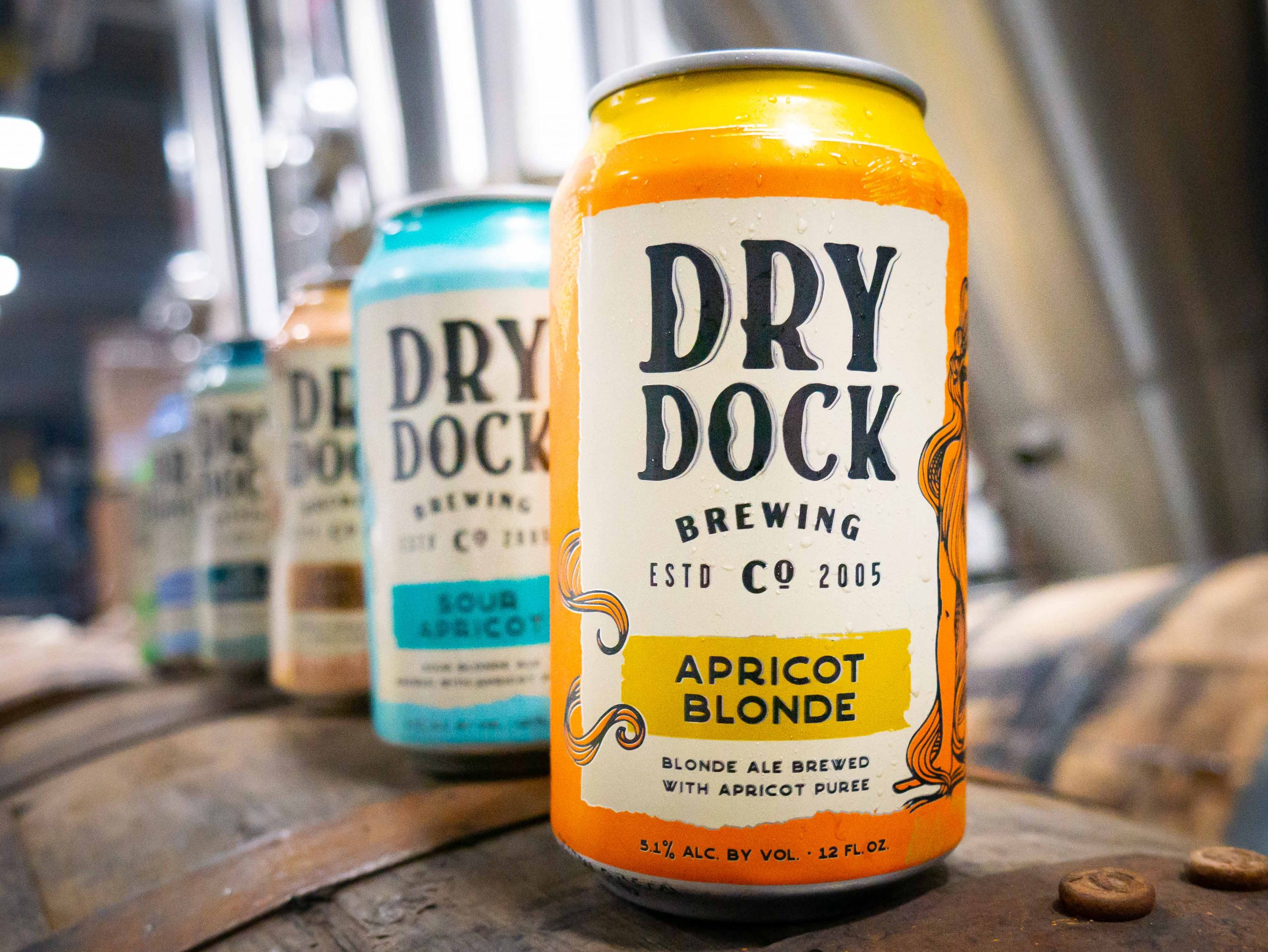
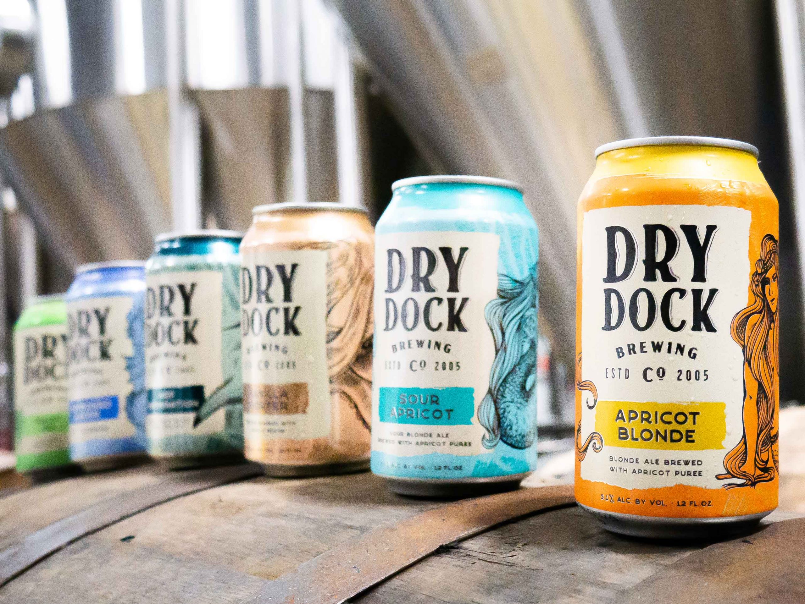
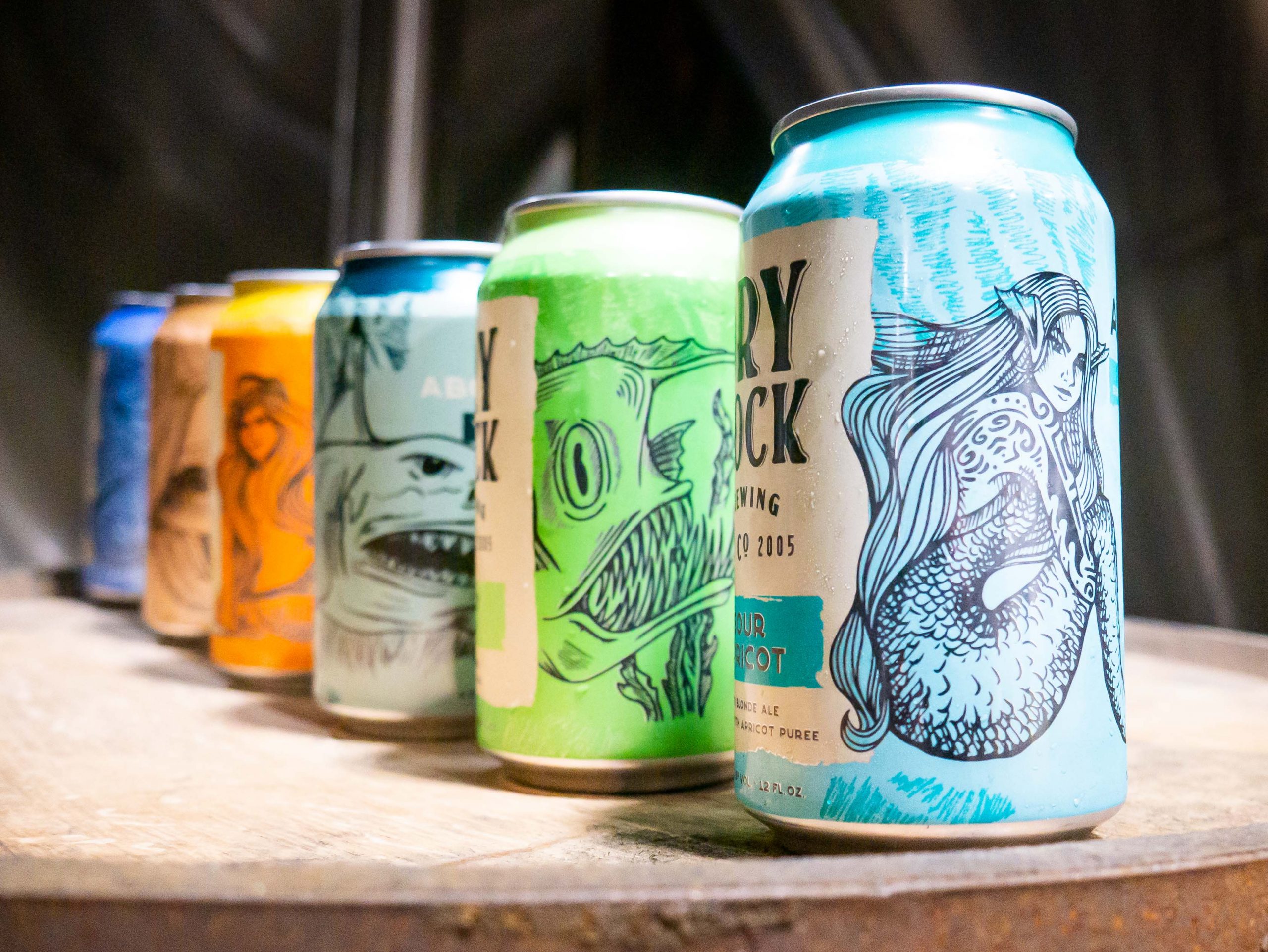
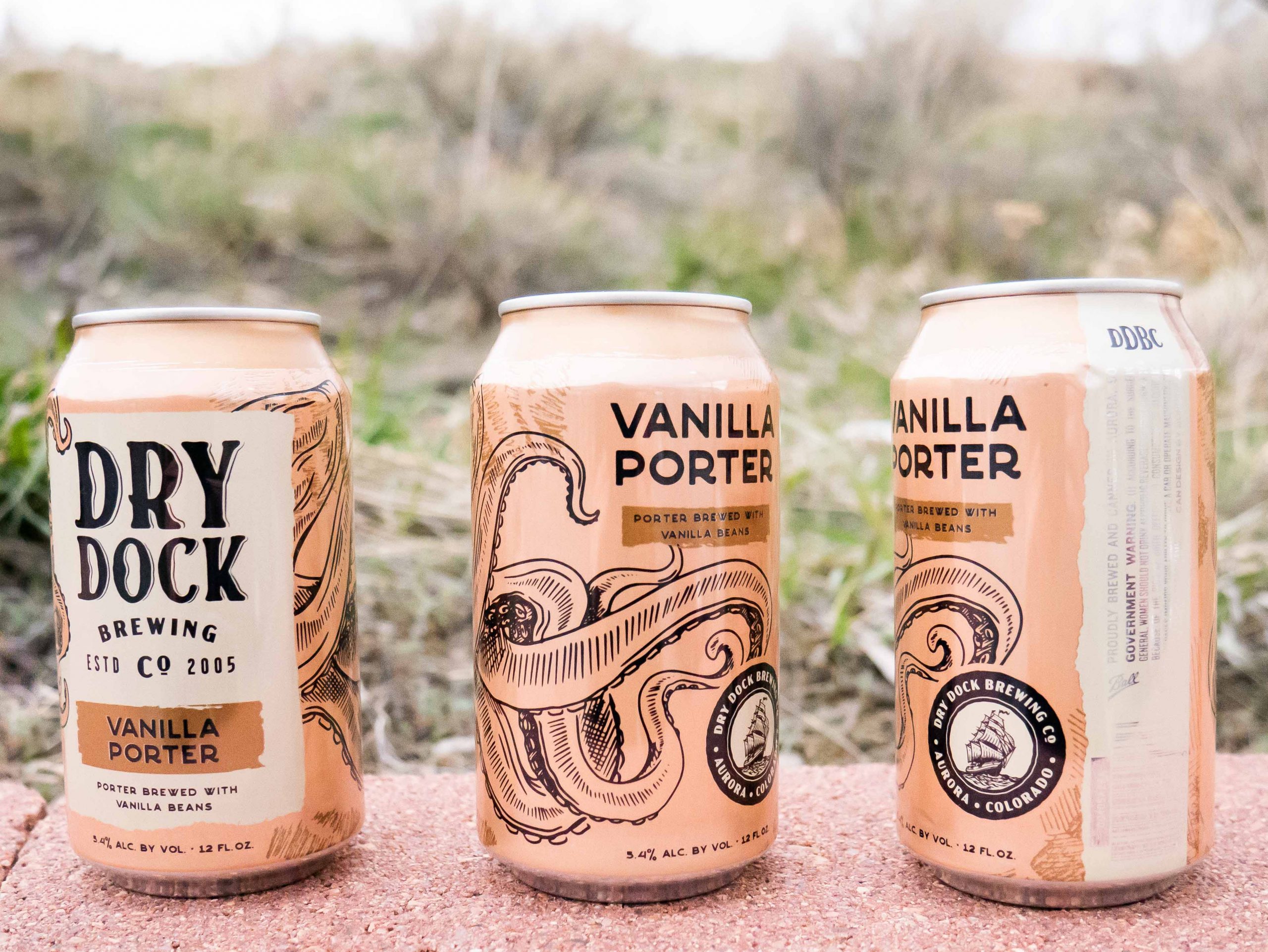
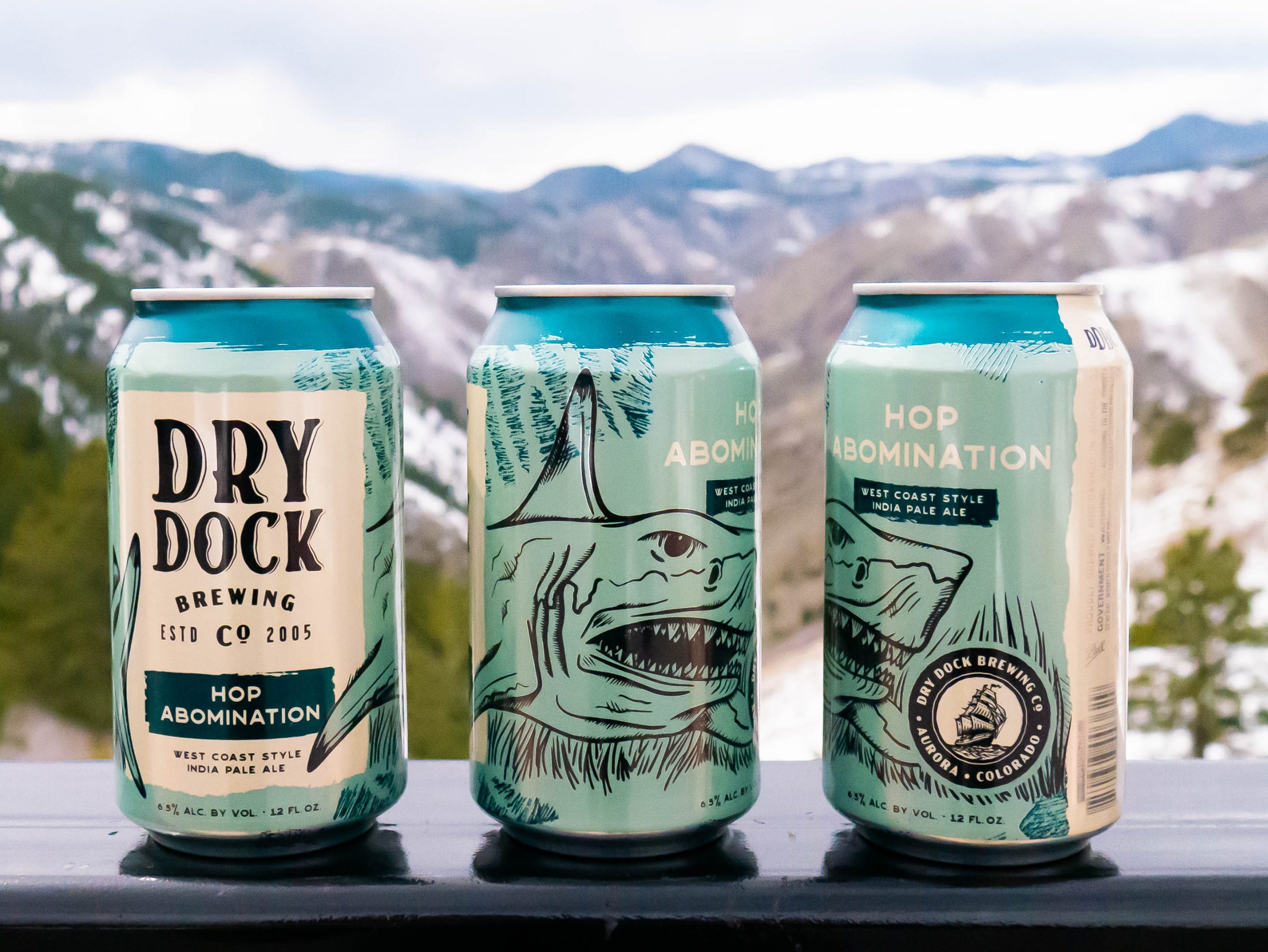
CANS
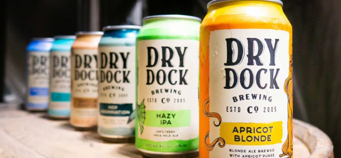
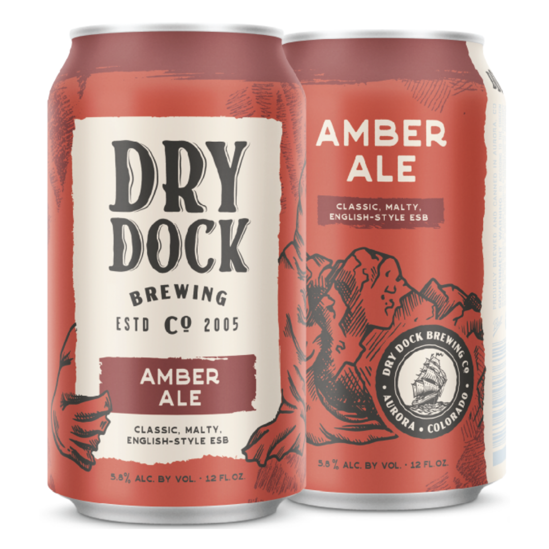
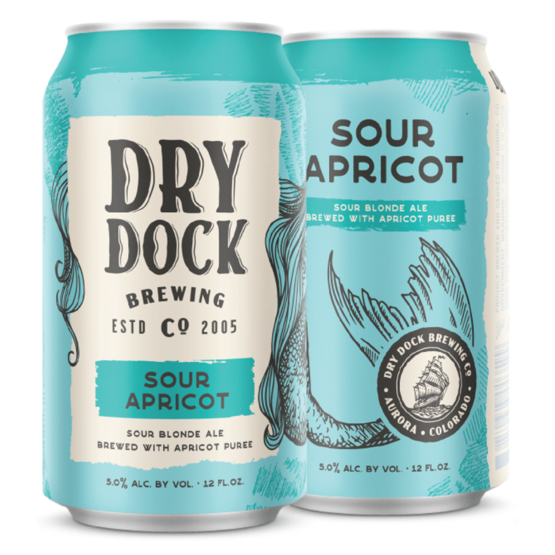
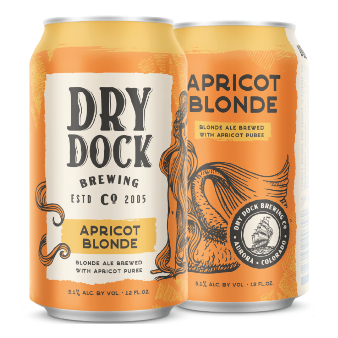
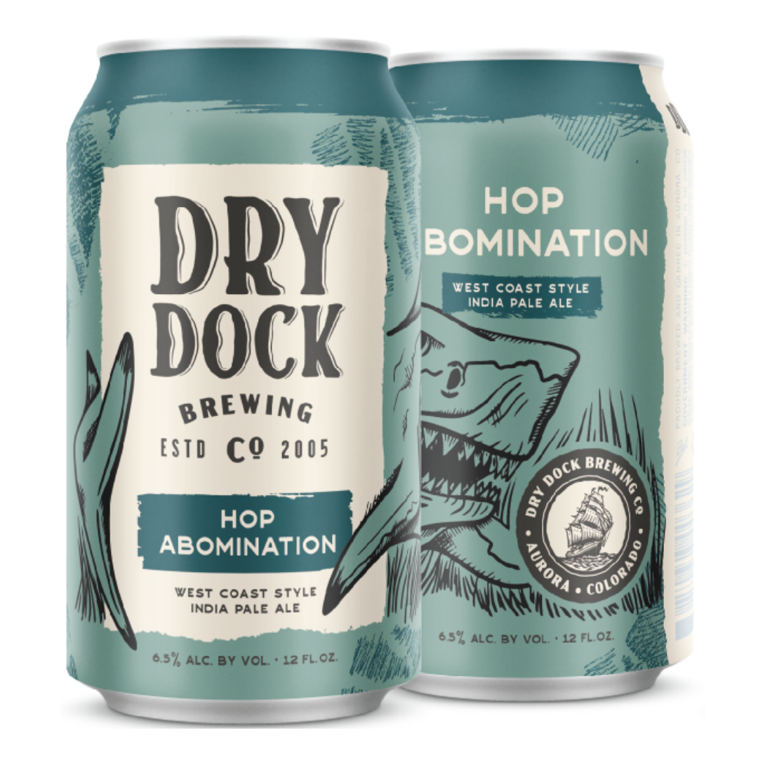
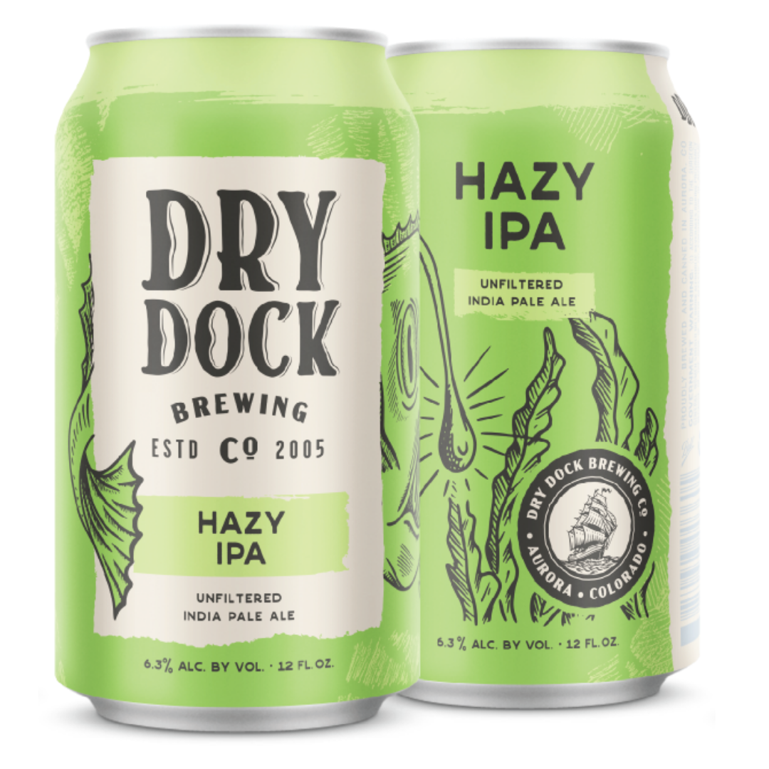
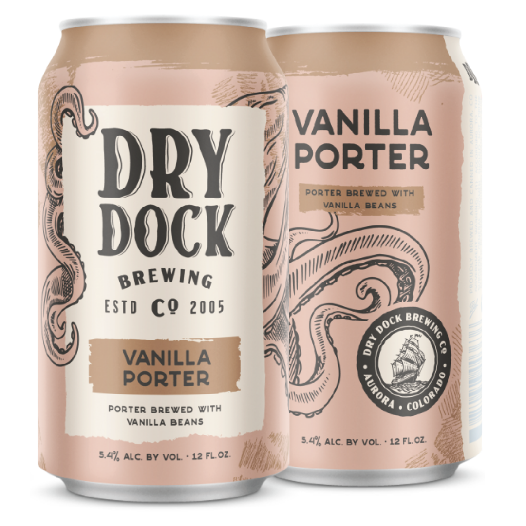
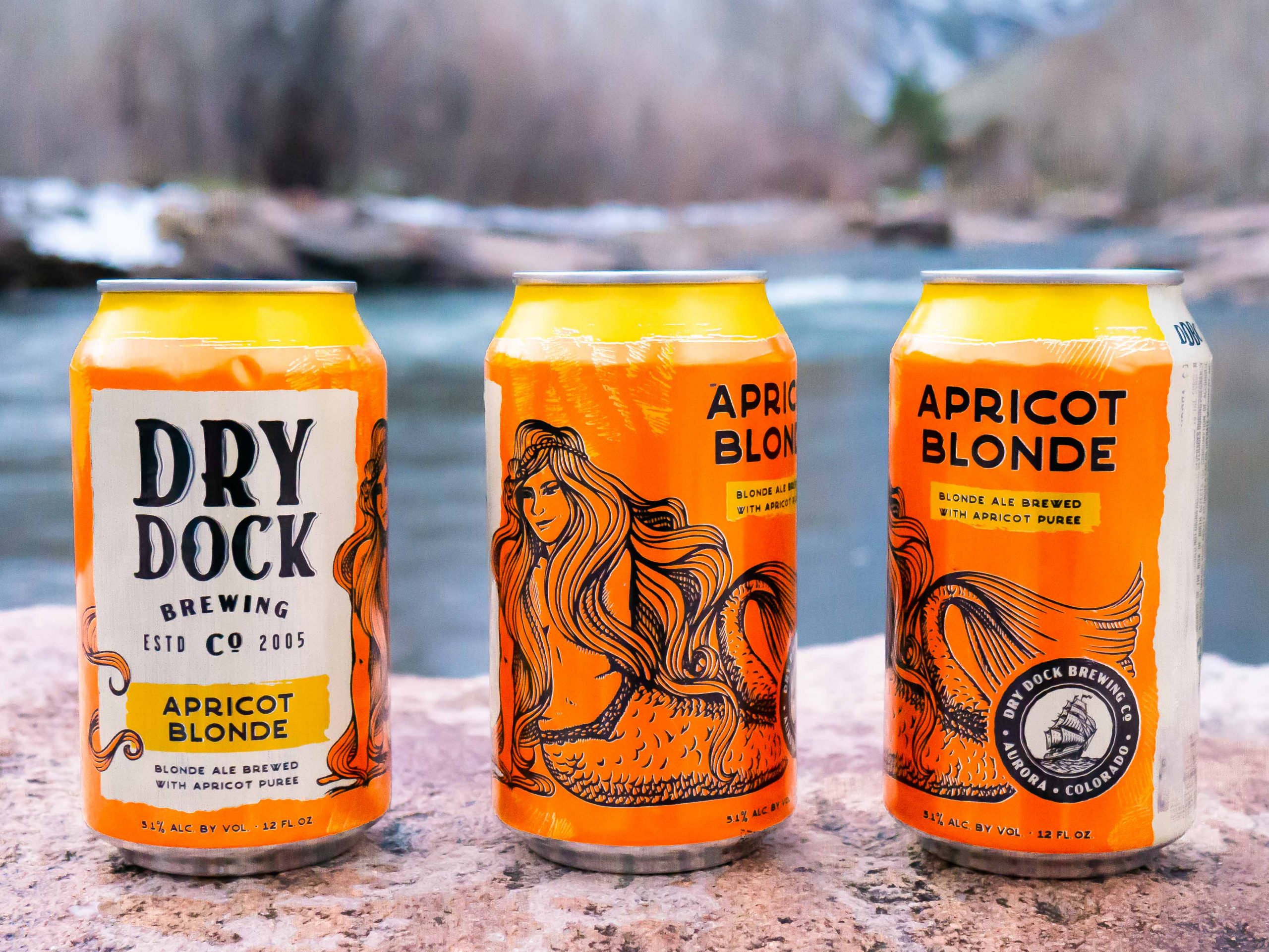
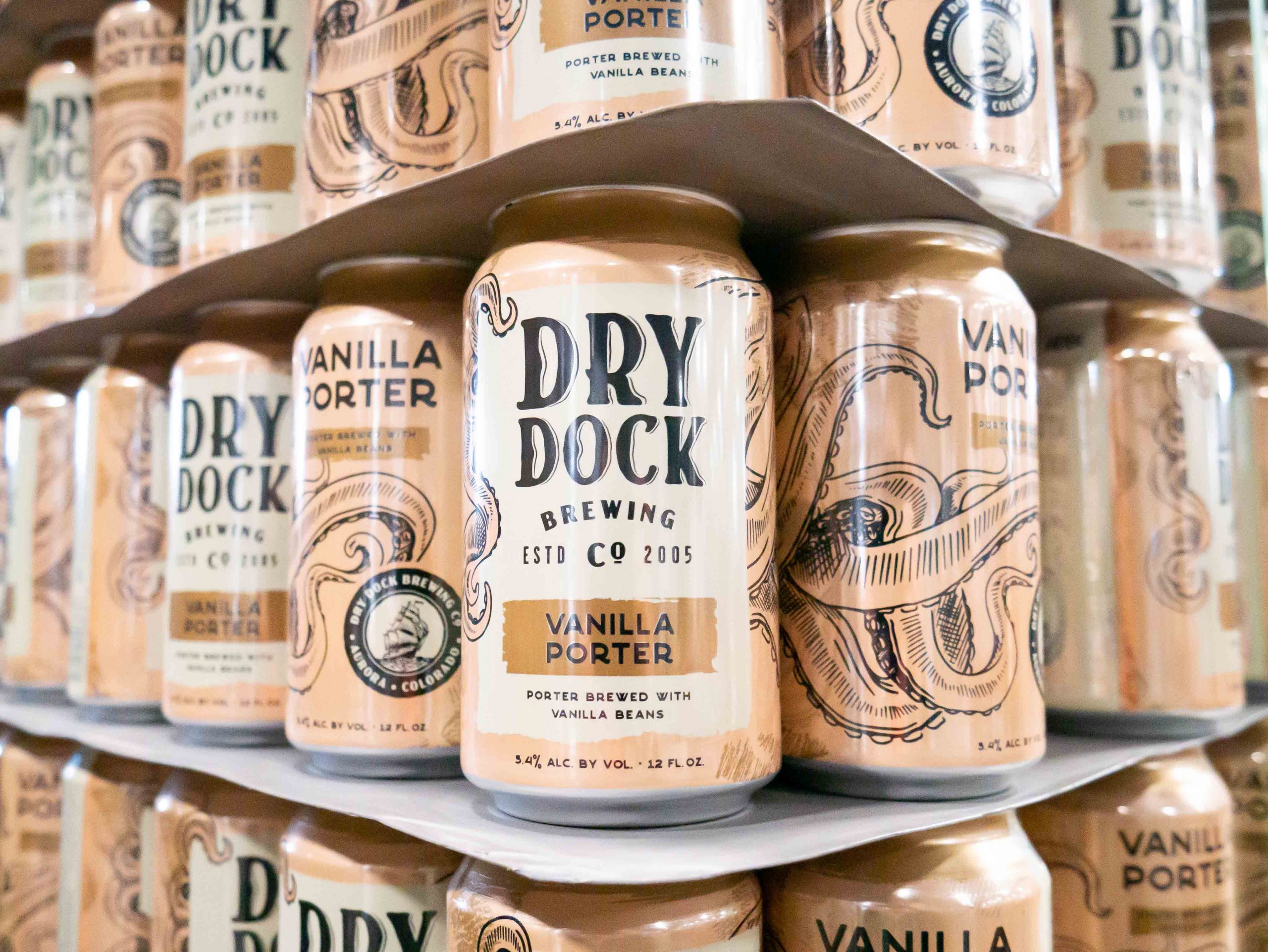
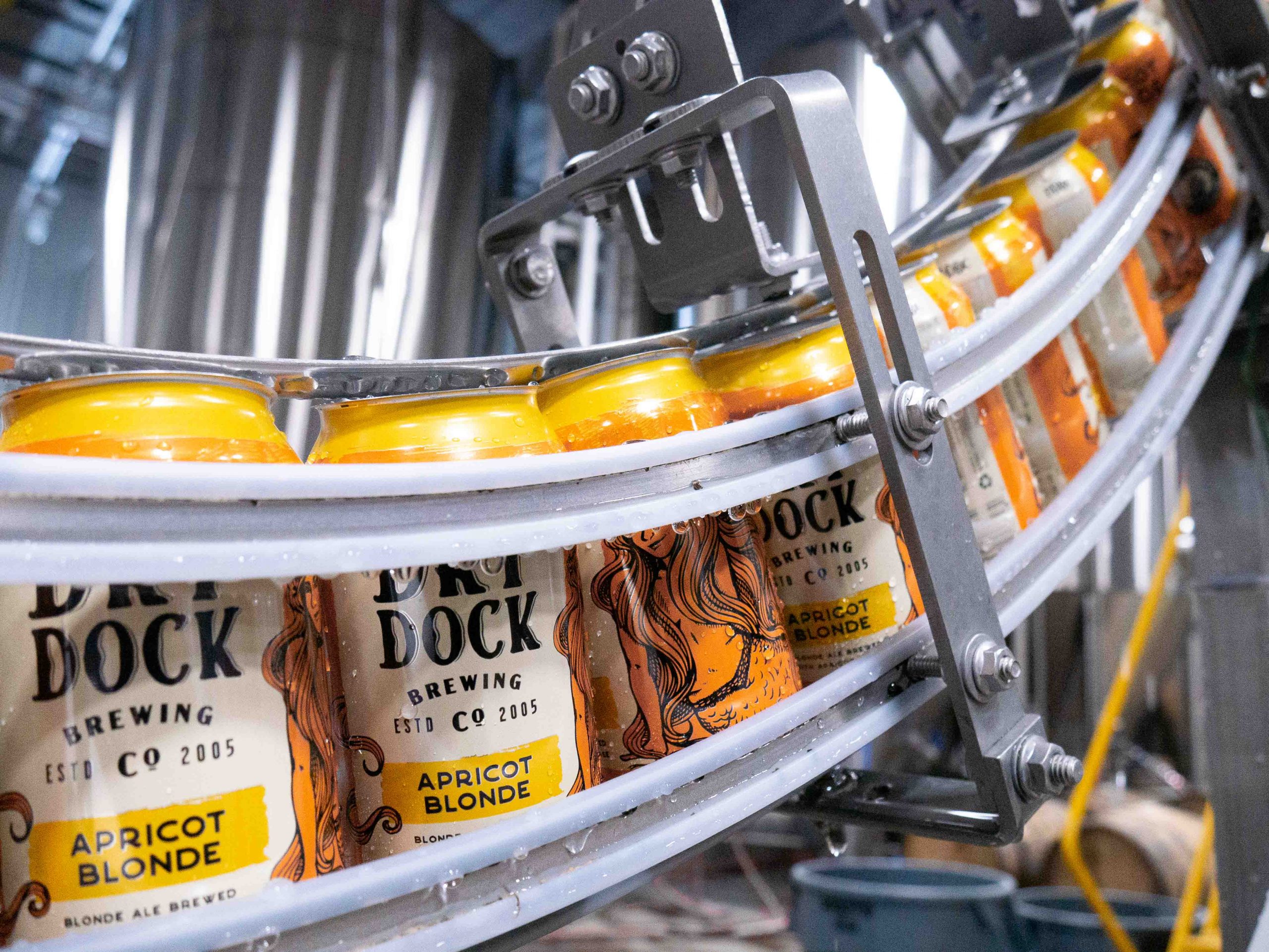
Each new can now features a prominent “DRY DOCK” text design in the center of the can where a golden ring was before on a white parchment design. Under the brewery’s name is the beer style on a weathered design that has the feel of parchment, ink highlight, or a flag. Under that, a longer description of the beer with all the ingredients used to make the beer. Wrapped around all of this is a unique sketch of an object that is largely unreasonable from the front of the can, which becomes clearer as you turn the can.
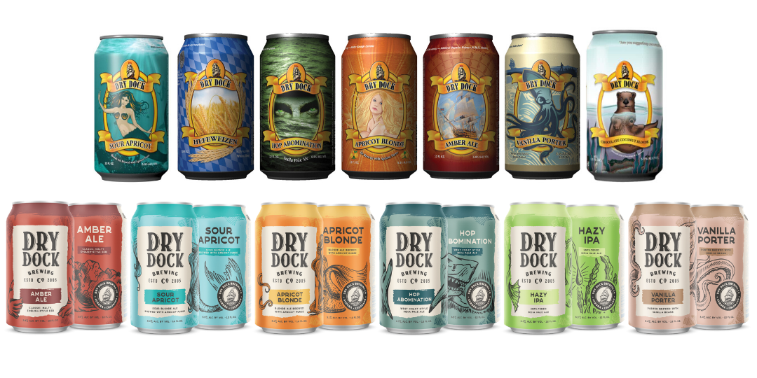
To the right of the can, the top font repeats the beer style in the same font as the front with the color of the can’s background matching that of the previous design and repeating the longer description, now with the weathered design highlighting the information. Under that, a refined sketch of the original design uses the background color and negative space to recreate a familiar brand.
Each can does this wonderfully, taking the original caricature and redesigning it in such a way that the can keeps the nostalgic feeling associated with the design and brings it into the future with a minimalistic touch. To the right of that, a black and white version of the new logo. On the bottom of the can on the front and back, the ABV and can size repeats itself with a simple black font. The last design piece above the government warning and barcode, a new “DDBC” stamp or brand marks the top of the can.
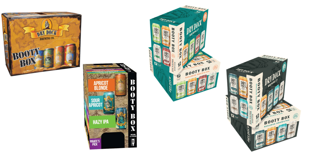
BOOTY BOX
Adding to the excitement of the new design, Dry Dock unveiled new Booty Boxes, which now include two different mixes of cans with two new “Exclusive Pirate’s Pick” beers, only available by purchasing one of these boxes. Both of the new Booty Boxes are complete redesigns, no single element was carried over. Instead of a treasure map as the prominent design of the box, the new boxes display the single color Dry Dock ship on all sides with a smaller circle logo on the top of the box and “DRY DOCK BREWING COMPANY” on the top and the side of the box with the same font as the can. Each box displays the four cans included in the box, eliminating the preview window of the Pirate’s Pick from the previous design. There are also key consumer elements that highlight the amount of cans in the box, the size of the cans, the exclusive Pirate’s Pick, and the inclusion of “DRY DOCK GIVES” which is the charity associated with sales of Booty Boxes.
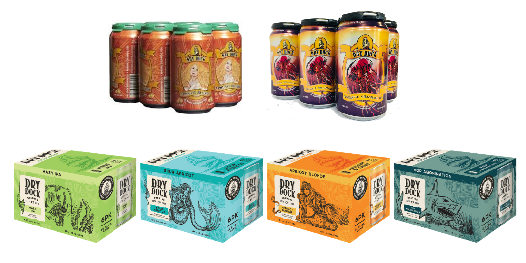
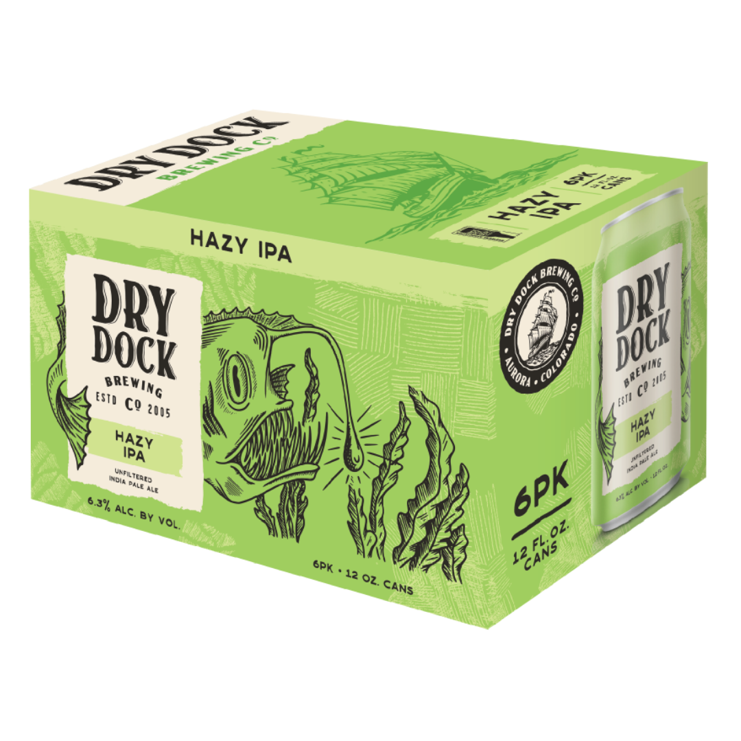
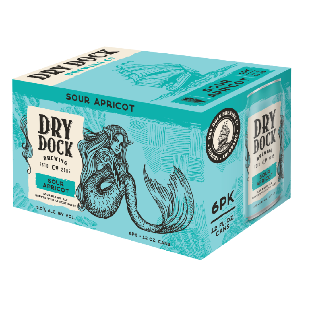
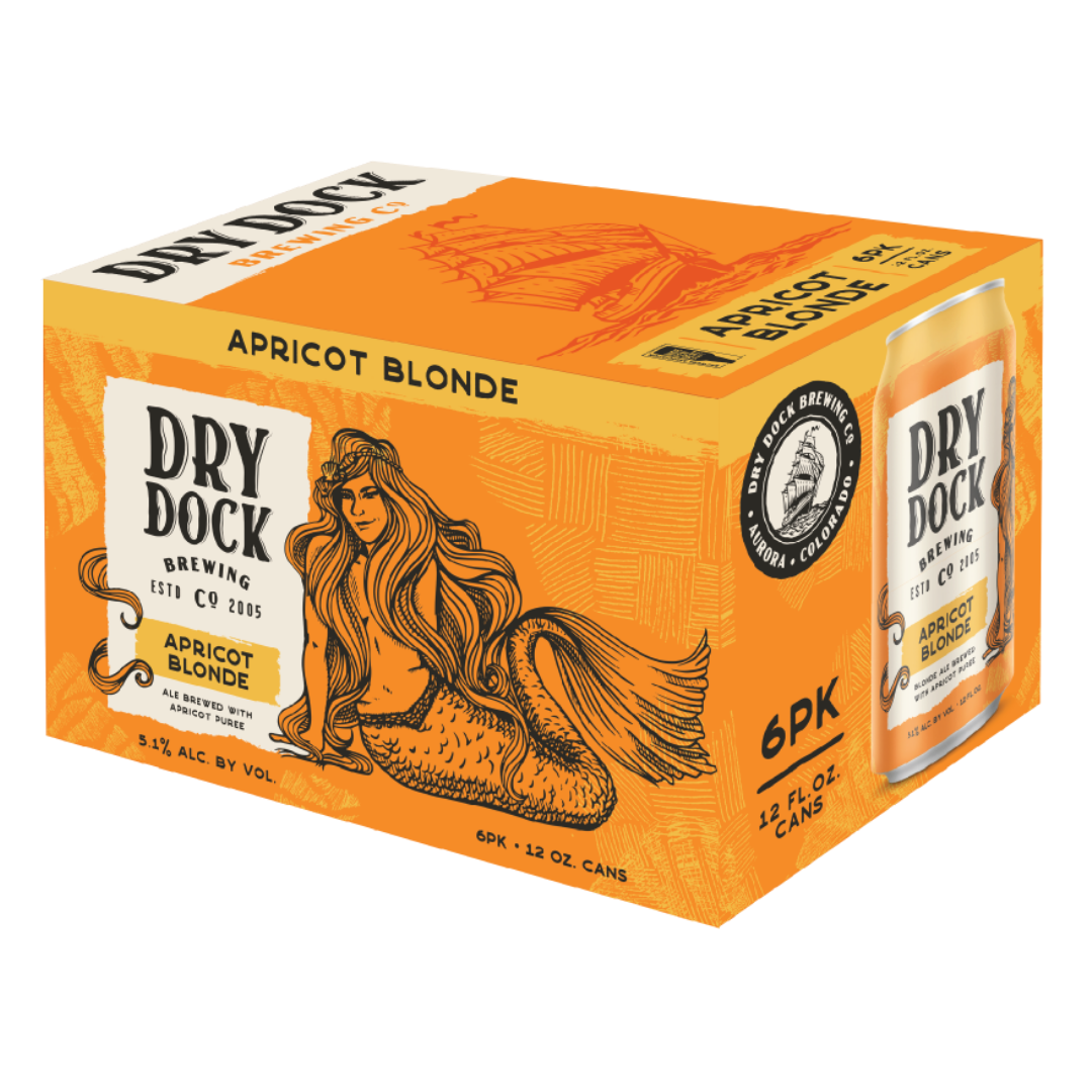
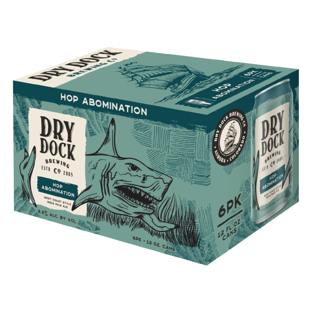
SIX PACKS
The biggest change and the most significant aspect of the redesign is that Dry Dock will now be packaging six-packs into branded boxes, rather than using PakTech holders. Each box takes full advantage of the new canvas by displaying a gorgeous caricature of each brand on the side of the box with the Dry Dock ship on the top of the box with elements from the can design. These six packs also include consumer elements that highlight the number of cans in the box, the size of the cans, and the ABV. Each beer style is displayed on the same white parchment design as the can and again on a mockup of the can itself on the box.
This refresh is set to launch in early May, with some sneak peeks of the first wave of updated cans and boxes reaching grocery and liquor stores later this month. Below are a few more images from Dry Dock brewing Company that show off the new branding.

Related Posts
The Lumbee Tribe Sues Anheuser-Busch & Distributor... June 27, 2016 | Cecelia Kathleen
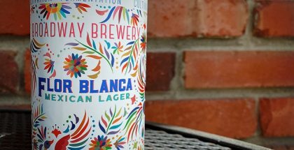
Broadway Brewery | Flor Blanca Mexican Lager... April 23, 2021 | Katie Camlin
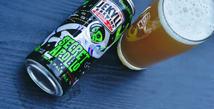
Jekyll Brewing | Secret Apollo IPA January 12, 2018 | Eric Jackson
Purpose Brewing Celebrates Two Years as Peter Bouckaert Declares, “Trends are ... August 15, 2019 | Jaclyn Menendez

Submit a Comment