
Beyond the quality of the liquid inside the bottle, strong packaging and labeling, the eye-catching face of a brand, is becoming paramount as a means of standing out on shelves tasked with propping up more and more craft SKUs than ever before.
Or, as Ian McLean, founder and creative director of McLean Design and a BevNET FBU (Food and Beverage University) instructor, said, “If you’re not seen, you don’t exist.” McLean, who is best known for designing the iconic Monster energy drink logo, is a proponent of branding that grabs a consumer’s attention as they shop the beverage aisles.
So it’s no surprise to see well-established beer brands – including many that are already recognizable in their own right – hit the refresh button every once in a while to update the packaging and artwork that facilitated their success in the first place.
But as the landscape evolves, so too do the considerations companies must take into account when re-branding their products, according to Oceania Eagan, founder and creative director of Blindtiger Design, a Seattle creative agency dedicated to the craft beverage industry.
One of the big shifts in how craft beer is branded these days, said Eagan, is the importance of keeping a thread throughout a portfolio to let consumers know everything comes from the same source.
“Back in the Sierra Nevada days, all they had to do was be the pale ale everybody wanted. They didn’t have to communicate a whole portfolio of beers,” she said. “As beer portfolios grow, the need to communicate the wide range of the portfolio allows for exploration within one brand rather than consumers being lost to other breweries.”
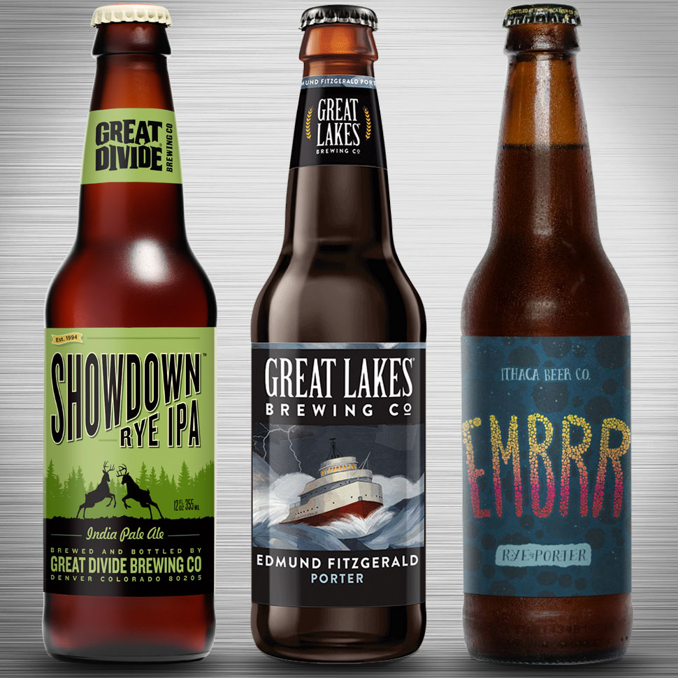
Already this year, three notable craft breweries – Great Lakes Brewing, Great Divide Brewing, and Ithaca Beer – have all launched redesigns in hopes of further strengthening consumer perception of their respective products.
Brewbound’s own creative director, Matthew Kennedy, took time out to weigh in on the efforts of each redesign below. See if you agree with Kennedy’s assessments and whether the breweries effectively communicated their entire portfolios.
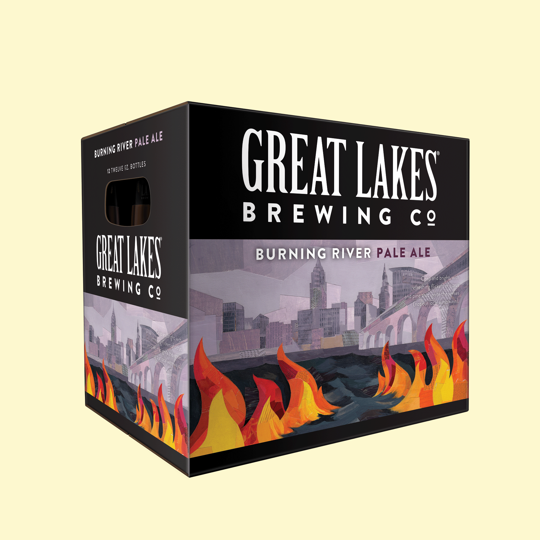
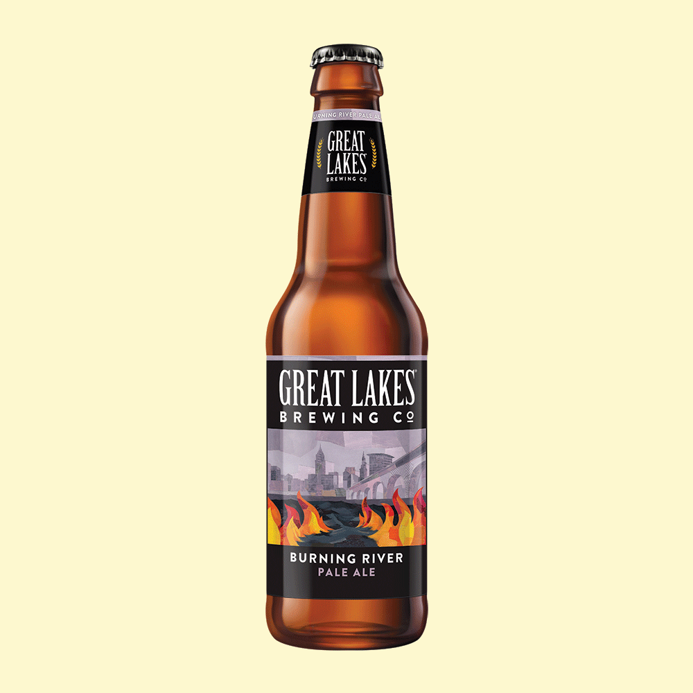
On Great Lakes: “To start, they haven’t made a terribly drastic change, but the logo is cleaner and more stylized. The font change is subtle, but has a more modern feel with better kerning and a bolder stroke. A few elements were eliminated, which leads to a much cleaner look. The new type was carried through to the labels as well and the result is much cleaner and easier to read. Extraneous text was left off of the front label, which also leads to an easier understanding of what’s in the bottle. The imagery hasn’t changed drastically, but the new hand-drawn images lend a sense of unity to the lineup.”


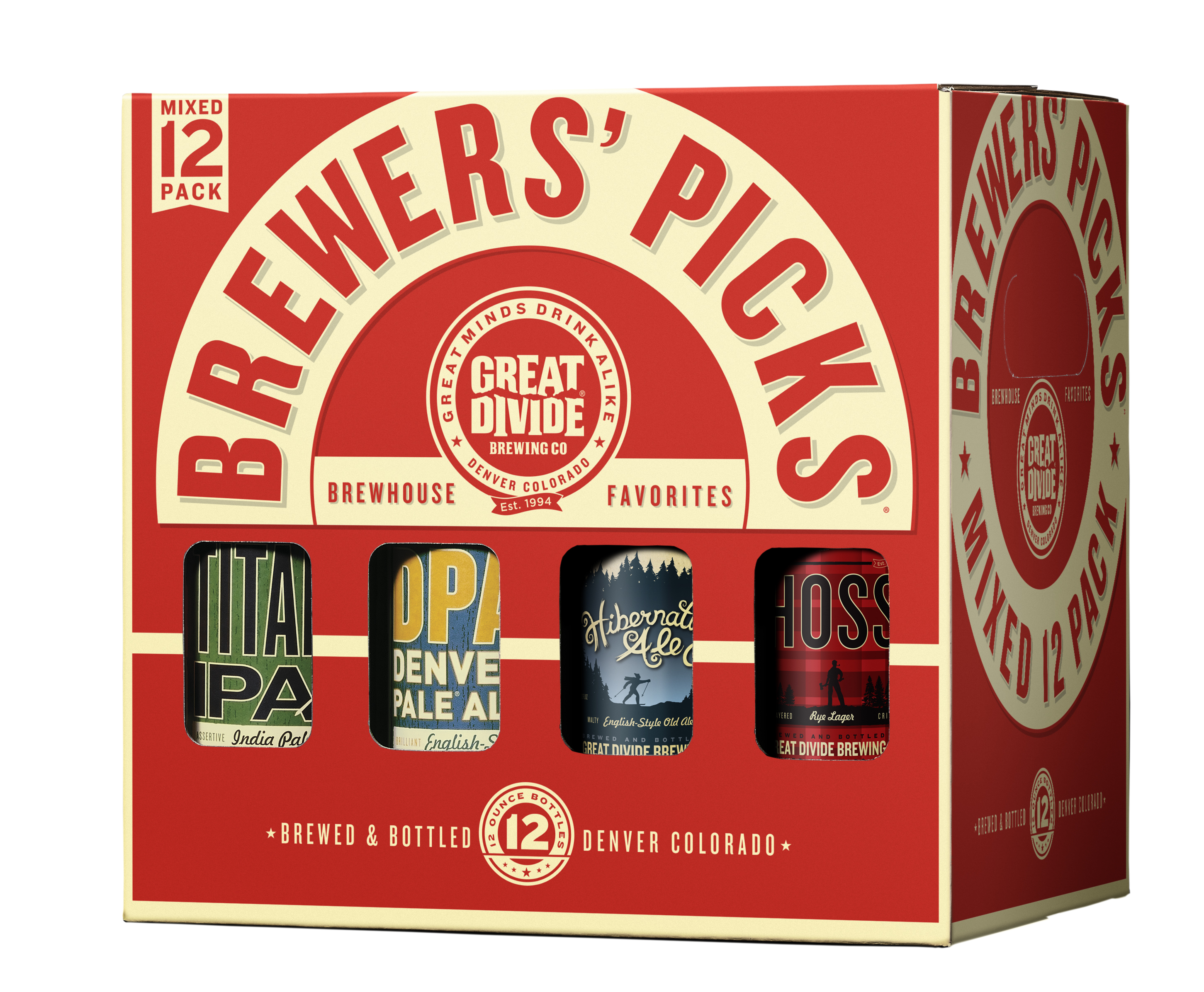
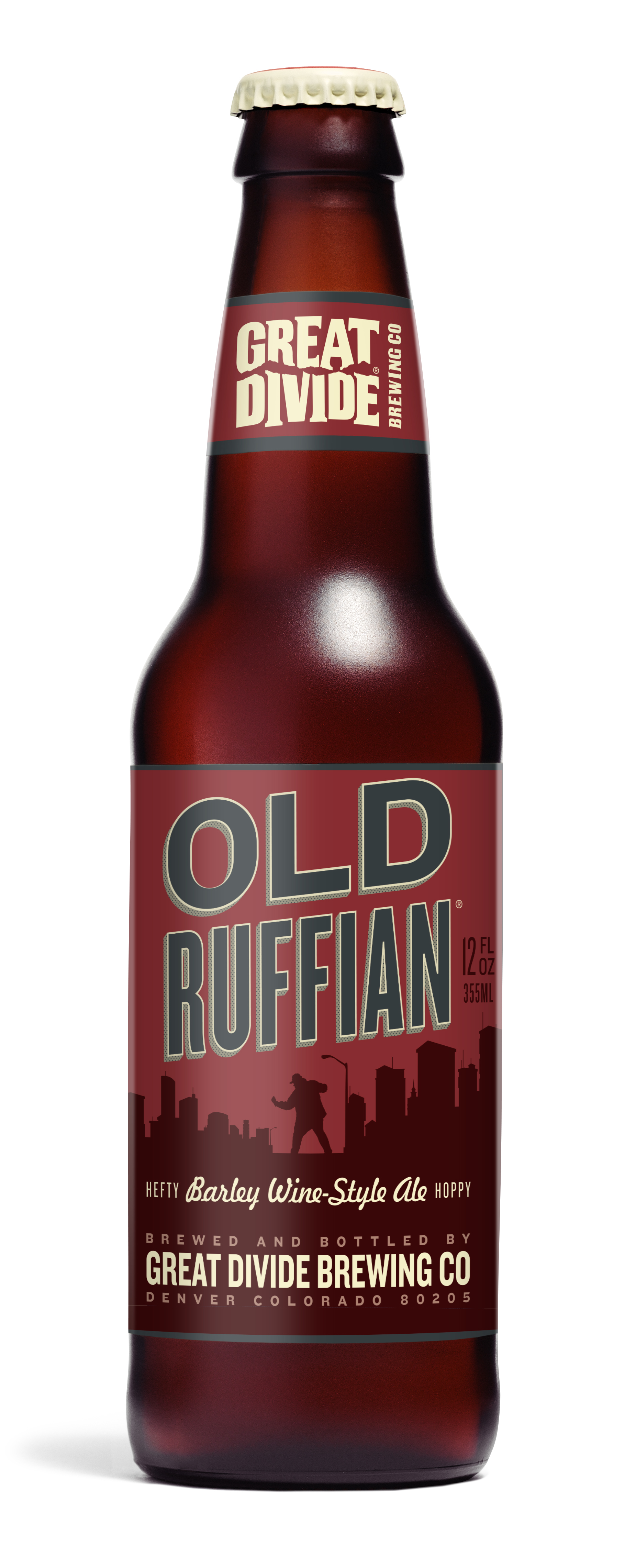
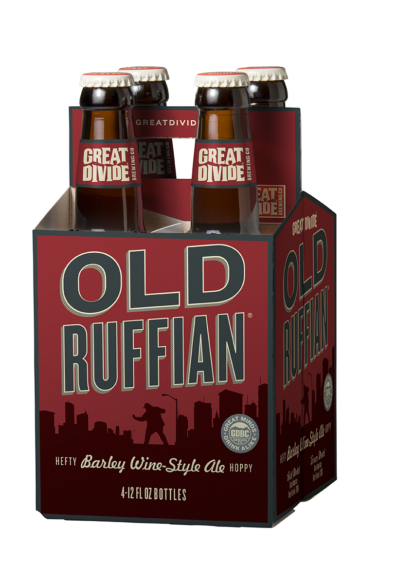
Matthew Kennedy on Great Divide: “Again, not a drastic change in packaging, but the new packaging shows more unity across the brand offerings. By using color across the full space of the label, each SKU is more easily distinguishable while still remaining part of the Great Divide identity.”


Matthew Kennedy on Ithaca: “The new six packs and labels appear to have a cleaner design with less ‘noise.’ Like Great Lakes, they have eliminated a lot of the typical craft beer designs, which, until recently, seemed to be ubiquitous (i.e. hop images on IPA packaging). They have toned down the presence of the brewery name and focused more on the brands. Also much like Great Divide, each SKU is easily identifiable which still remaining part of the Ithaca brand.”
